
BurnOne
BurnOne is a THC-Infused Hot Sauce company. Proud of their background, BurnOne has ingrained elements of Black history and culture into every aspect of its branding. Recognizing the disparity in Cannabis related arrests and Cannabis entrepreneurship in the Black population, BurnOne is taking actionable steps towards closing those gaps.
THE STORY
It’s MLK weekend in NYC and my sorors and I head to do some community service in Brownsville, Brooklyn, when we meet a man selling an array of THC-Infused products. Among those were cookies, gummies, and hot sauce. With the legalization of Cannabis in New York, I’ve notices a ton of new and interesting infused products and drinks, but this was the first (and remains the only) time I came in contact with infused hot sauce and I was enthralled. Though I turned down the sidewalk edibles, I remained heavily amused by the interaction.
Before building this brand, I had some criteria that needed to be met. It must be fun, it must affect change, and it must be Black at its core. As a quintessential part of Black culture, branding hot sauce allowed me the opportunity to speak on some of the issues I’m passionate about, and create something full of purpose.
ART DIRECTION - Scott Laserow
INSTITUTION - Tyler School of Art and Architecture, Temple University
c. 2022
BRANDING
PACKAGING
SOCIAL MEDIA


Look & Feel
The look and feel pull color inspiration from the Pan-African flag and color commonalities identified in flags across the Black diaspora. Bold, rich, and spicy, these colors are a reflection of the sauce i.t
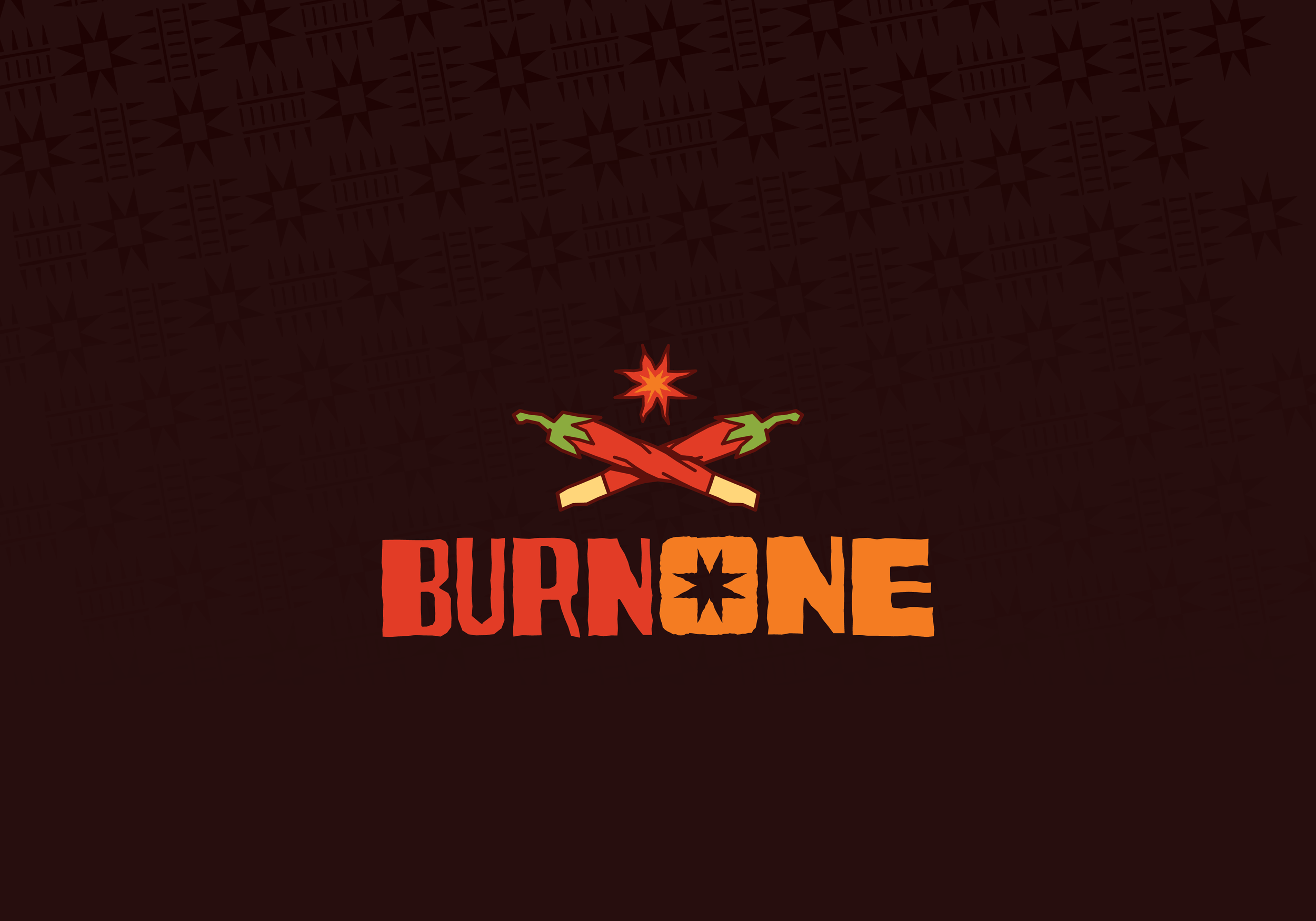
Incorporating Black culture in every way I can meant utilizing the colors of the Pan-African flag with a few other additions that appear in flags across the Black diaspora. Bold, rich, and spicy, these colors are a reflection of the flavors to expect, as well as the people they represent. With hand-lettered type, the logo evokes feeling and authenticity much like the many wooden works of art that appear throughout Black history.

Pattern
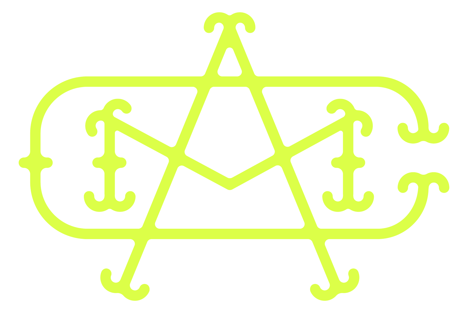
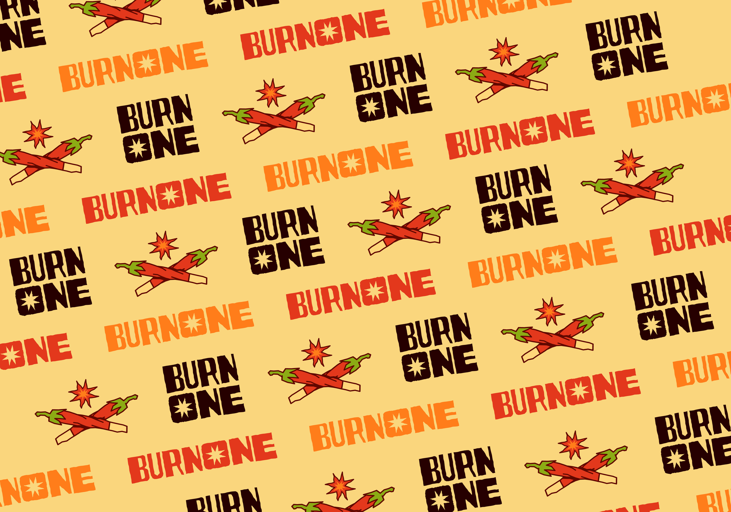
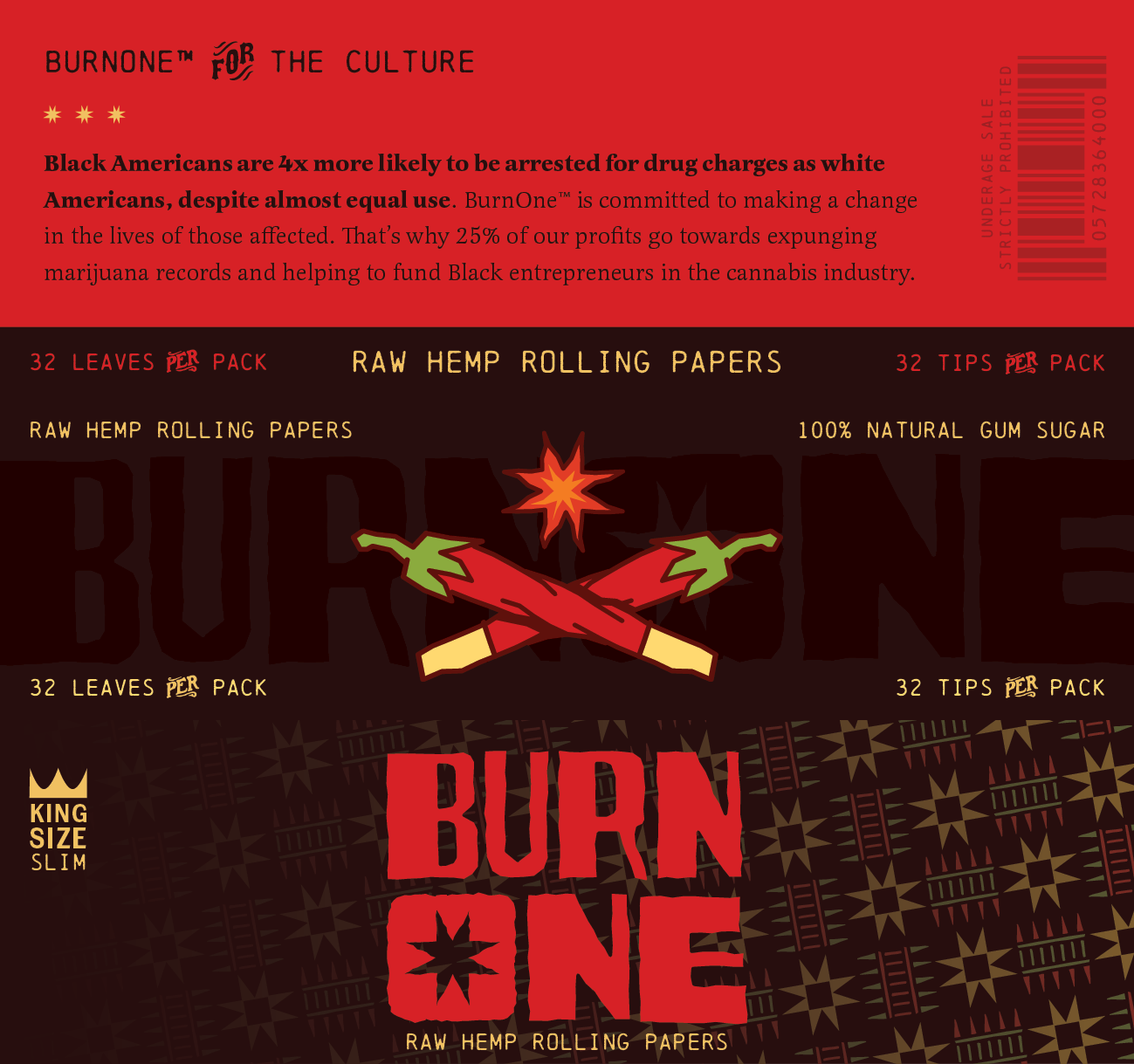
This pattern pays homage to the Underground Railroad with motifs pulled from quilt codes. These codes were used to communicate with those escaping slavery, and the North Star code acted as a guiding light, a symbol of hope, and an instruction to continue following the star north towards freedom. Using these symbols, the pattern design resembles Kente Cloth in its repetitive and moving nature.


Packaging
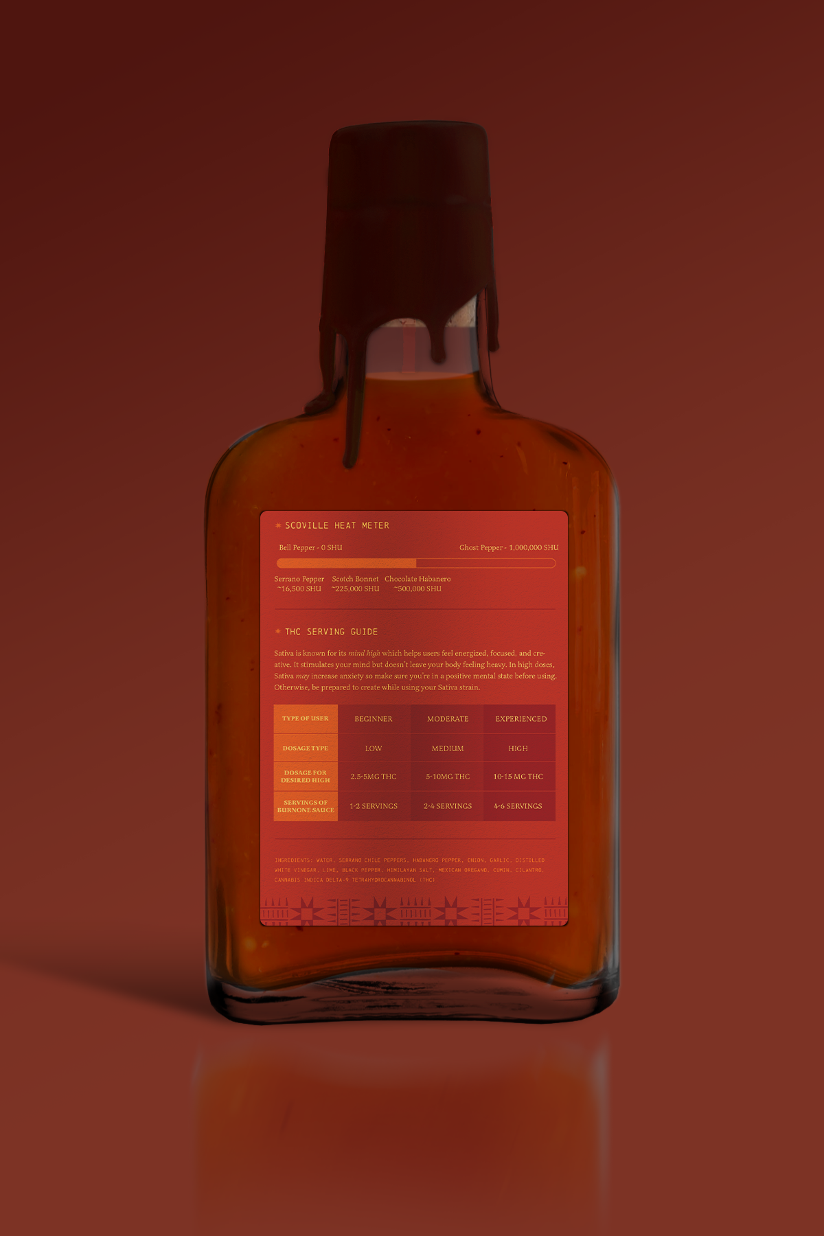
The design avoids the common overuse of the Cannabis leaf in product packaging in favor of a more artisanal style. The logomark visually combines a joint and a pepper to hint at the product’s infused nature. As the sauces increase in fiery flavor (and become slightly more potent) the label colors increase in saturation and contrast. A wax drip top over a cork adds to the design’s artisan feel while also ensuring the freshness and flavor stays in tact. Lastly, displaying the THC content was an important part of the design which ensures that the consumers get the exact experience they’re desiring.


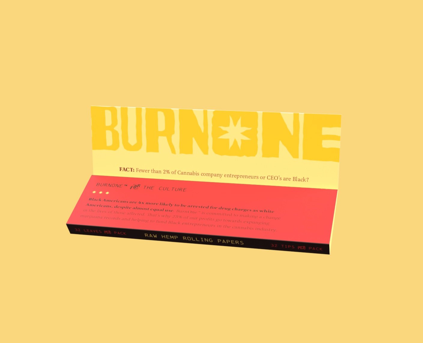
Rolling Papers
As a physical novelty, each bottle of BurnOne sauce comes with a pack of rolling papers with colors that pair with the bottle. The papers in each package are custom made so when rolled they resemble the pepper-joints featured in the logo. Each pack of papers comes with a quick fact to encourage action in causes which align with the company’s purpose.


Social Media
Burn One takes advantage of social media as an opportunity to showcase brand values. Here they would speak about the disparities facing Cannabis entrepreneurs, Cannabis related arrests, as well as other topics which align with their purpose. These would include posts which support Black farmers and using locally sourced produce.


Just light it all into flames. And Imma BurnOne for you. - Brent Faiyaz